
1KL
Rent or buy? Run a simulation to see all the outcomes…
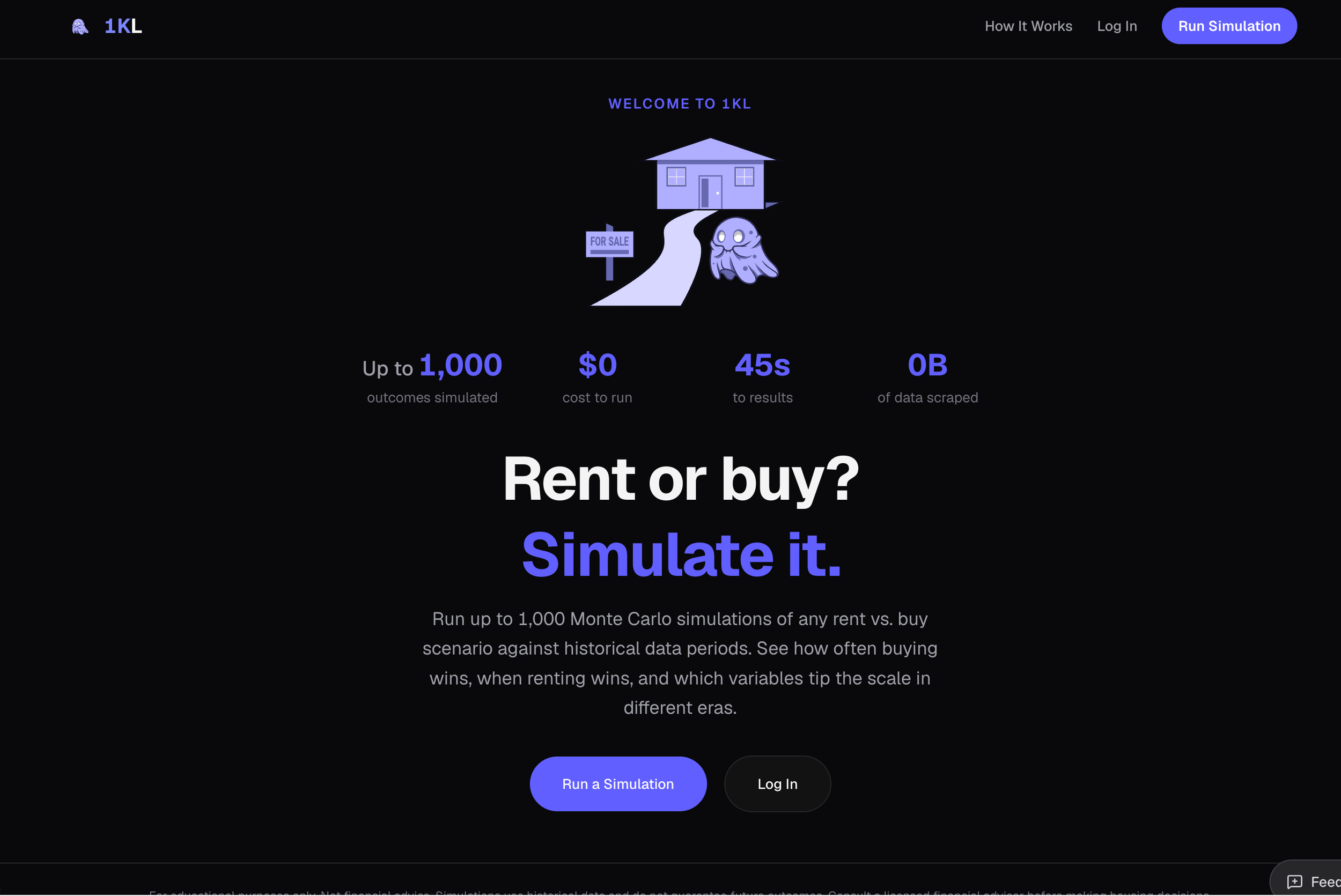
Home and rental market simulations
The traditional "Rent vs. Buy" housing calculator is functionally flawed. It provides a single, optimistic outcome based on static assumptions (e.g., "7% stock growth forever"). This design fails to account for macroeconomic volatility or personal "chaos" (layoffs, medical debt, major repairs), often leading users to make $500,000 illiquidity mistakes.
How do I simulate +1,000 different outcomes?
Product experience challenge: How do you design a high-performance simulation engine and data visualization system capable of modeling 1,000 parallel lives—a concurrency challenge involving ~120,000 data points—without overwhelming the user?
Technical challenge: State management and concurrency. I needed the engine to perform 1,000 parallel calculations—fetching Shiller IE market data and FRED economic data (image_5.png) in real-time—without blocking the main browser thread.
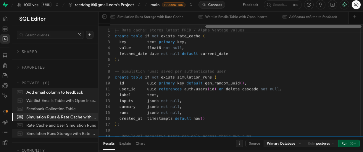
A glimpse into the schema
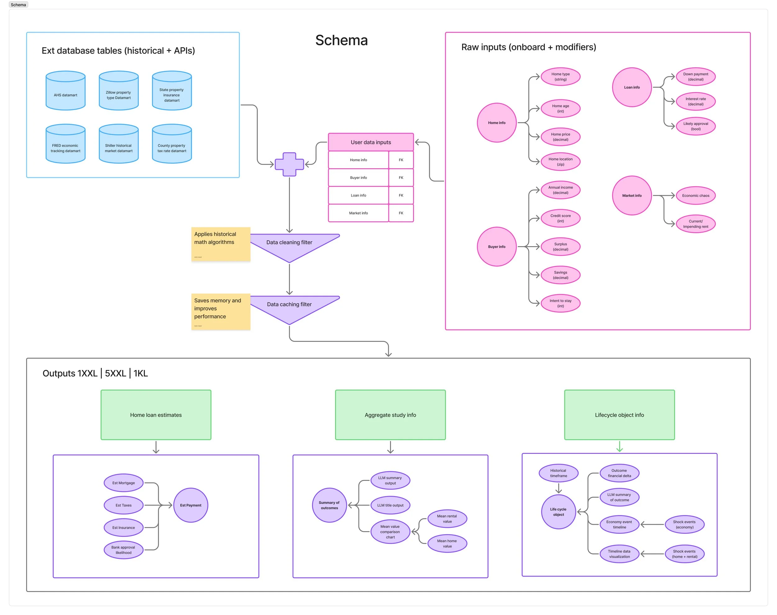
A common failure state in complex product design is a mismatch between the designer's ideal layout and the technical realities of data fetching, latency, and schema structures. To ensure 1KL was performant and technically feasible, I mapped the entire relational data flow and application state architecture before writing a single line of layout code.
This schema served as our team's cross-functional single source of truth, aligning product logic with data engineering dependencies.
1. Decoupled Ingestion & Relational Integrity
The application architecture relies on marrying high-latency external market variables with dynamic user inputs.
The Ingestion Layer: I mapped out explicit database tables and third-party API requirements, defining dependencies for real-time hooks like the FRED economic tracking dataset, Shiller historical market dataset, and hyper-local county property tax tables.
Relational Normalization: To maintain systemic state control, the architecture passes raw inputs (Onboarding + Modifiers) into unified, parameterized relational tables utilizing clean Foreign Key relationships. This decoupling ensures that any upstream adjustment to an asset or buyer variable dynamically cascades across the entire model without triggering systemic data re-fetches.
2. Engineering for Performance: Optimization Filters
Running 1,000 stochastic lifecycles locally is an expensive compute task that risks blocking the frontend execution thread. I accounted for this resource constraint directly in the logic model:
Data Cleaning Filter: Applies historical math algorithms early in the data assembly pipeline to eliminate corrupt or incomplete array fragments before processing.
Data Caching Filter: Built specifically to save browser memory and improve runtime performance. By caching static historical matrices, the simulation engine can run infinite parametric variations locally without pounding the server, guaranteeing a fluid 60fps UI experience during continuous user scrubbing.
3. Deterministic Output Component Mapping
The bottom layer of the schema dictates exactly how complex calculations are cleanly modularized into predictable frontend layout components:
Home Loan Estimates: Isolates linear, deterministic calculations (Mortgage, Insurance, Localized Taxes) to feed immediate transactional feedback.
Aggregate Study Info: Routes macro-outcomes through an LLM wrapper to generate context-aware synthesis payloads alongside the mean financial delta arrays.
Lifecycle Object Info: Maps out a highly granular event payload schema—tracking distinct chronological timelines, financial state arrays, and contextual economy/housing "shock events"—to hydrate the forensic timeline panels gracefully.
How do we calculate this?
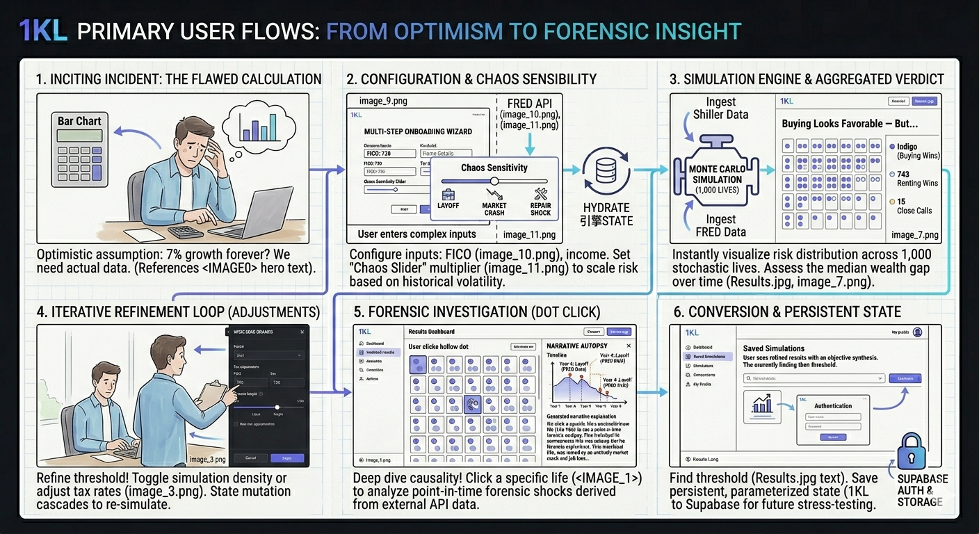
We achieved this challenge by building a decoupled architecture. I designed a configuration wizard that simplifies complex inputs like home age, down payment, and FICO score, translating them into a raw simulation configuration JSON.
The final step of the wizard introduces the defining competitive moat: "Economic Chaos Sensitivity." I designed this slider to act as a dynamic 'volatility multiplier' on the underlying probability engine. If set to 2x (maximum chaos), the "economic downturn engine" (driving by FRED unemployment data) increases personal shock probability from a 1% base to a 5% historical high.

The data and its home
The project itself lives in a Gitlab I set up previously and uses an external database schema that I built to house the multi-layered data-mart. The frontend python only needs to make a quick call to the backend in order to retrieve the data. The mathematical adjustments are then applied to the dataset.
This dual-tiered architecture had a significant positive impact on front-end performance through data caching and efficient service calls, (it also doesn’t crash Windsurf every 5 simulations).
The API dependencies are also minimal and reliable, running once every 24 hrs to collect data like federal interest rate, which makes this project a self-sustaining standalone data structure.
Visualizing a market lifecycle
Traditional bar charts or line graphs cannot communicate the distribution of risk in a 1,000-life dataset. I needed a design that prioritized cognitive load reduction and instantaneous risk analysis.
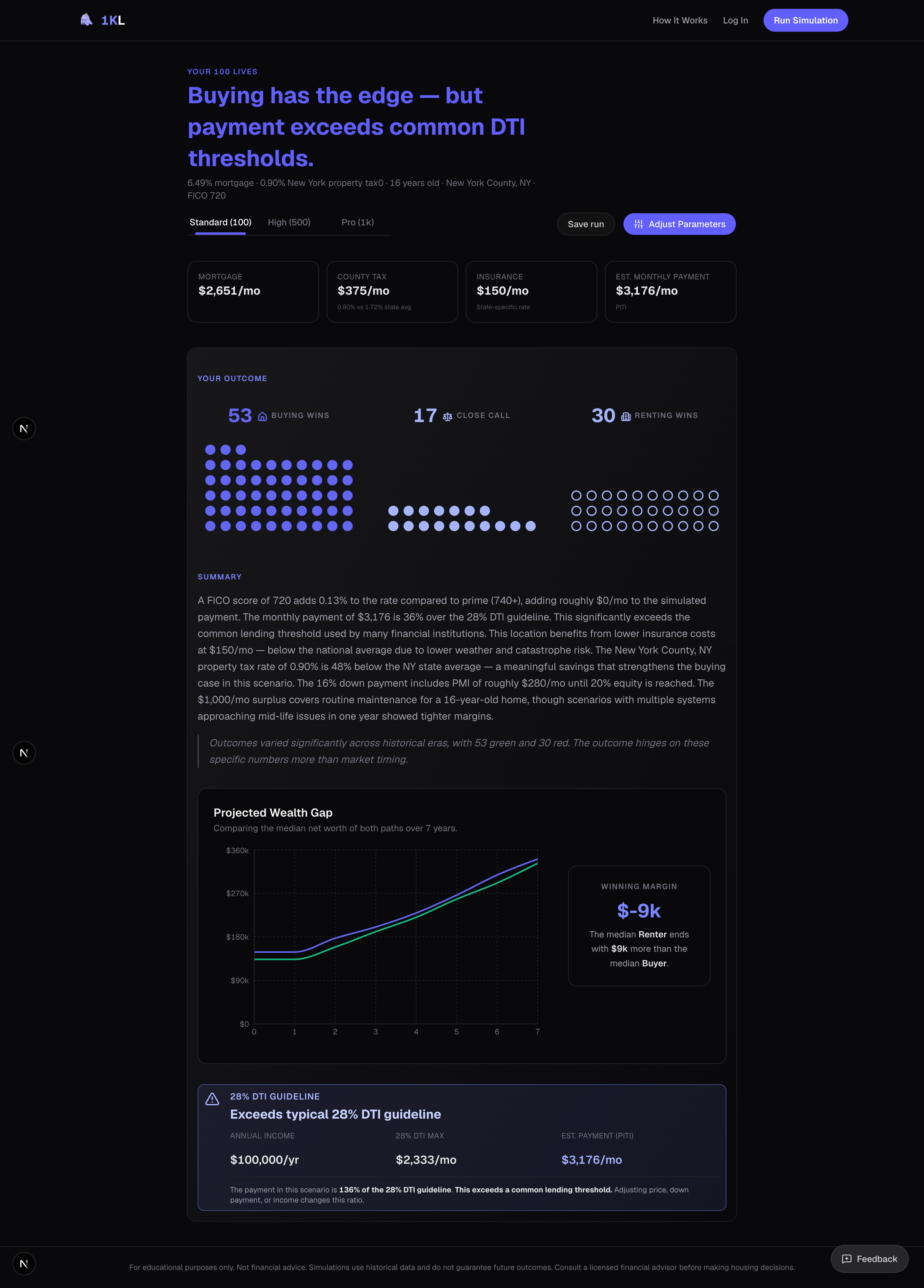
I designed the 1KL Waffle Grid (image_7.png). By visualizing each of the 1,000 parallel lives as a single, high-density dot and categorizing them via "Buying Wins" (Indigo circle), "Renting Wins" (Hollow circle), or "Close Call" (Grey circle), I transformed thousands of complex data points into an instantaneous visual assessment of risk distribution.
Seeing 1,000 dots is a stress test; seeing why a specific life failed is the product's ultimate value. I designed the "Narrative Autopsy" drawer to function as a forensic accounting tool.
When a user clicks a dot, a wide side-drawer appears with further detailed information I prioritized information density here, combining a wide-axis "Net Worth Path" chart (to make volatility tap-able/hover-able) with a text narrative generated dynamically from the data model.
This is where the system closes the loop on data integration. When a user hovers a "Shock Marker" on the chart (the pink or orange dots), it highlights the corresponding event button (e.g., "Year 4: Layoff" derived from the FRED API data), explaining precisely why "Life #65" resulted in $73,000 of failed equity.
Aggregating and adjusting data
Running a high-concurrency simulation is only half the architectural battle. The other half is translating the resulting data avalanche—up to 1,000 distinct time-series dataframes, each containing decades of variable financial events—into a scalable, instantly legible dashboard.
To solve for variable payloads, I designed a UI layer that functions as an intelligent aggregator, parsing the raw JSON output of the Monte Carlo engine to surface "signals" from the "noise."
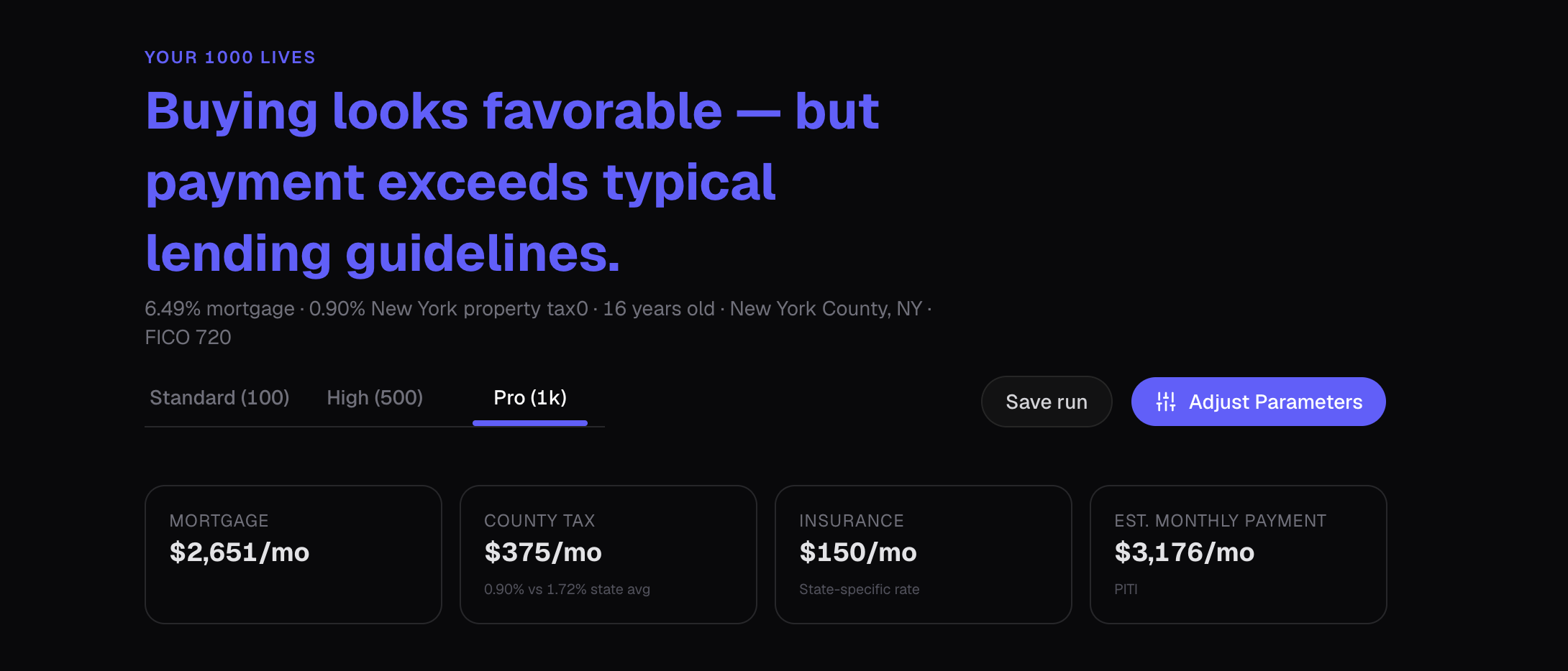
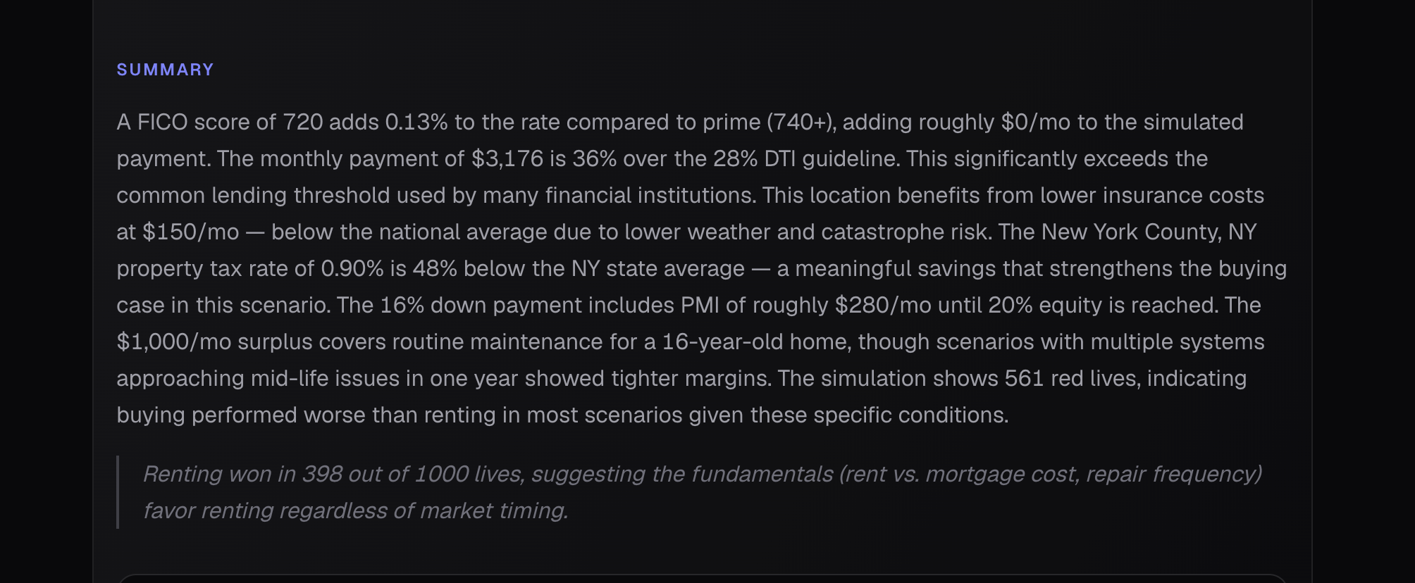
Algorithmic Headlines: Instead of a static "Results" header, the system programmatically generates a nuanced verdict. By evaluating the win/loss distribution against hard financial constraints (like a 28% DTI threshold), the UI outputs context-aware insights such as, "Buying looks favorable — but payment exceeds typical lending guidelines".
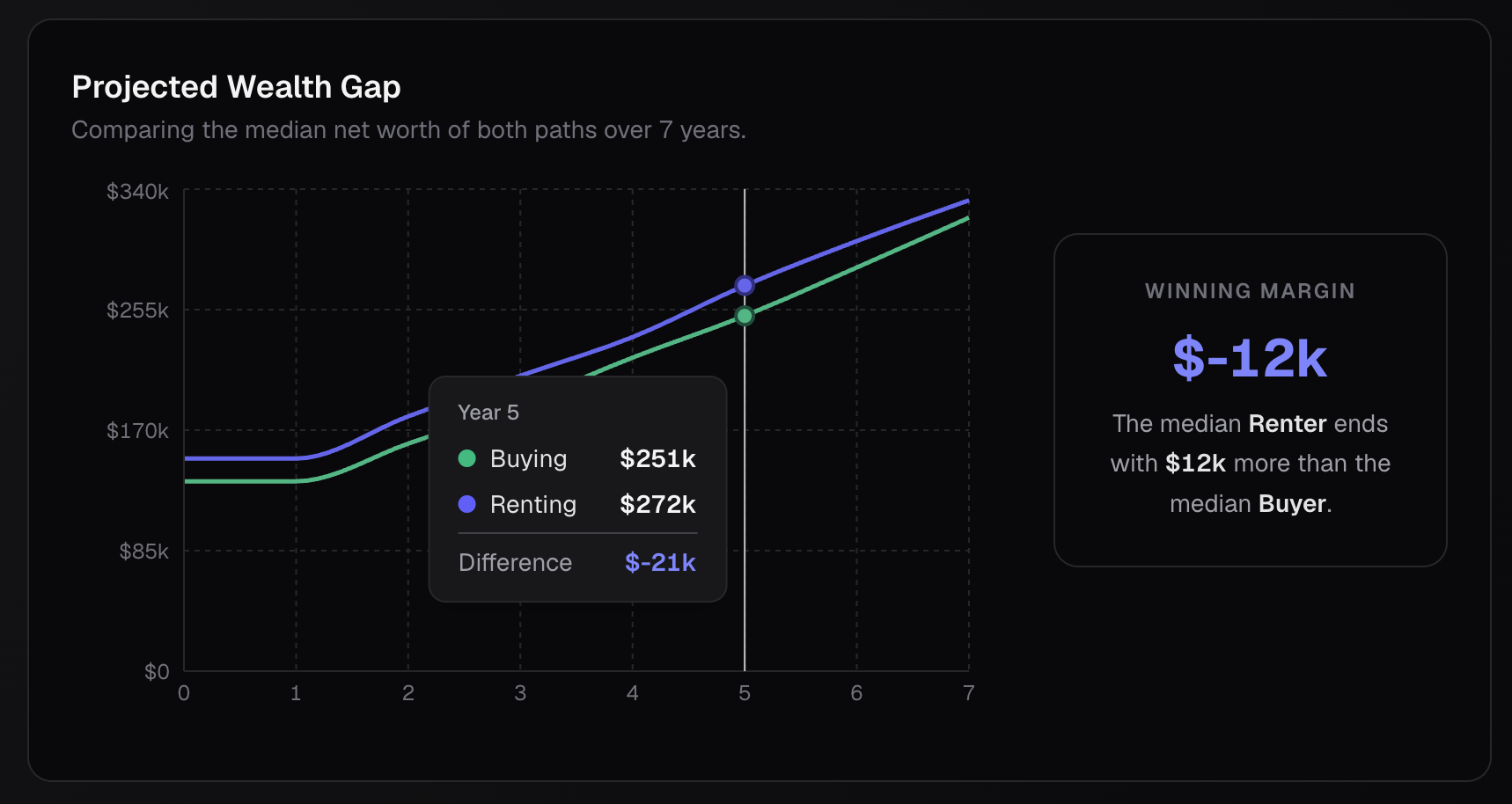
Isolating the Signal: Plotting 2,000 overlapping trajectory lines (1,000 buy vs. 1,000 rent) creates visual chaos. I designed the "Projected Wealth Gap" module to compute and render only the median paths over the user's defined hold period. This provides a clean, interactive comparison metric—complete with hover-state deltas—that scales flawlessly whether the user is simulating 100 or 1,000 lives.
Parametric Narrative Generation
Data visualization is not enough for complex financial tooling; users require causal explanations. I architected a dynamic text summarization block that acts as a localized data-interpreter.
Contextual Variable Injection: The Summary block does not display generic advice. It ingests the user's specific parameter adjustments (e.g., FICO 720, NY property tax rates) and maps them against the simulation's failure states. It mathematically explains why the distribution skewed a certain way, noting how local tax rates or routine maintenance costs eroded margins across the 1,000 runs.
The Forensic Micro-View: While the main dashboard aggregates macro-trends, the "Narrative Autopsy" side-drawer allows for micro-inspection. By mapping discrete API-driven events (like historical rental shocks) directly onto the user's net worth timeline, the UI transitions seamlessly from a macro-summary to a forensic, point-in-time analysis.


Future steps and more
I learned how to decouple UI from a static backend. Instead of designing a calculator with fixed inputs, you built an interface capable of managing extreme concurrency. I learned how to visualize 1,000 parallel outcomes and compute median wealth gaps over varying time horizons without blocking the browser thread or overwhelming the user.
I also learned that users don't just want the final score; they want the receipts. By creating the "Narrative Autopsy," I learned how to map discrete, API-driven events (like rental shocks or market crashes) directly onto a localized net worth timeline.
Finally, I learned that a true "moat" involves governance. By evaluating results against hard financial constraints—like triggering warnings when a scenario exceeds the 28% DTI lending guideline—I proved we can design enterprise-grade, compliant guardrails. Additionally, navigating a potential run-in with the SEC, I learned how to frame risk objectively, balancing aggressive "Chaos Engine" volatility with educational safety, rather than packaging it as a traditional financial analysis tool,